Designing for Real-World Use: Considerations
TYPOGRAPHY
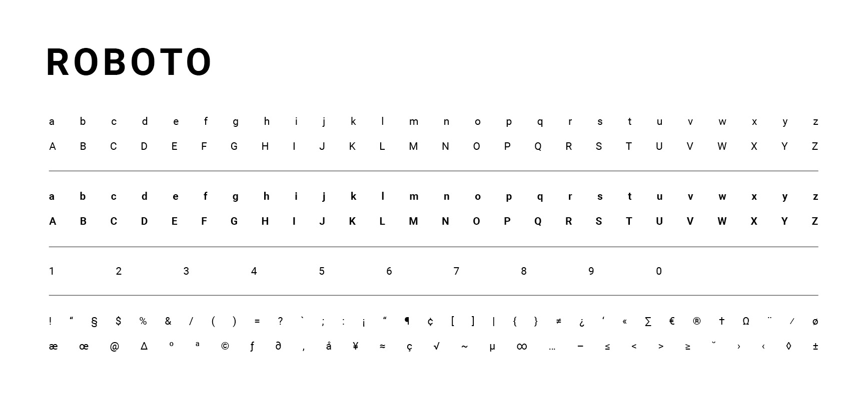
Because JSI works internationally, typography needed to be practical as well as distinctive. We selected typefaces that were widely available at no cost across platforms and devices, including Microsoft and Google products, Mac and PC environments, print, and digital applications. This was especially important for staff working in remote or resource-limited settings. We also designed templates with ease of use in mind, so teams could create materials consistently without needing specialized design software or extensive design support.
IMAGERY
We wanted the new visual identity to reflect the people and communities JSI works with, prioritizing authentic photography over stock imagery whenever possible. This required us to consider not only the visual direction of the brand, but also the practical systems behind image collection and usage.

COLOR
The color system needed to balance brand expression with accessibility and cultural considerations. We evaluated color combinations with Section 508 accessibility requirements in mind while also considering how colors could be interpreted across the diverse communities and regions where JSI works. The resulting palette was designed to provide enough flexibility for a wide range of applications while maintaining a cohesive visual identity.

ICONOGRAPHY
The icon system needed to hold its own within the new visual language, particularly when used alongside the cobblestone pattern and other strong visual elements. We selected icons with enough weight and presence to remain legible without competing with the rest of the system. We also considered how the icons would function digitally, including the potential to implement them as a web font, which helped inform the final direction.

THE COBBLESTONE PATTERN
Unable to change JSI’s existing mark, we looked for another distinctive element that could strengthen brand recognition. The resulting cobblestone pattern was inspired by the city grids of John Snow’s historic cholera mapping.
We designed the pattern as an integral part of the visual system rather than a decorative element, giving JSI a flexible and recognizable brand device that could extend across print, digital, and environmental applications.

From Brand to System
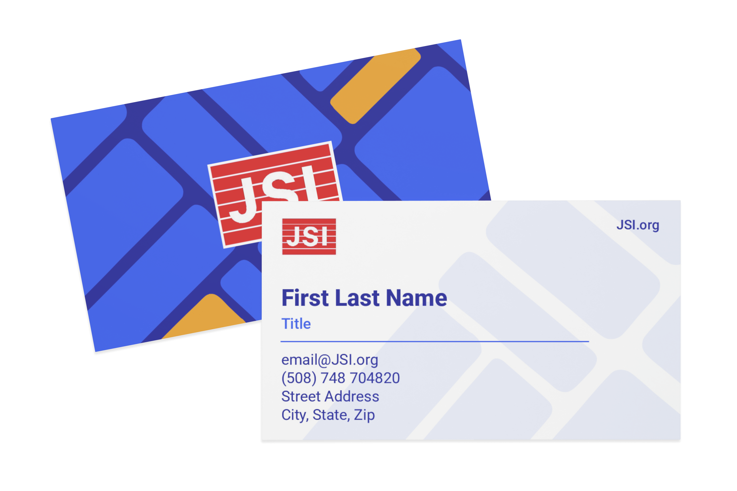
A strong visual identity needed to work beyond a brand guide. The design system was developed with the many people, platforms, and materials it would need to support in mind, including presentations and proposals to reports, social media, newsletters, conferences, and everyday communications.
We built a flexible set of tools and applications that allowed teams across JSI to work consistently without requiring specialized design software or extensive design support. The goal wasn’t simply to make everything look consistent, but to create a system that was recognizable, flexible, accessible, and practical enough to work across the organization.


 Translating the Brand to Web
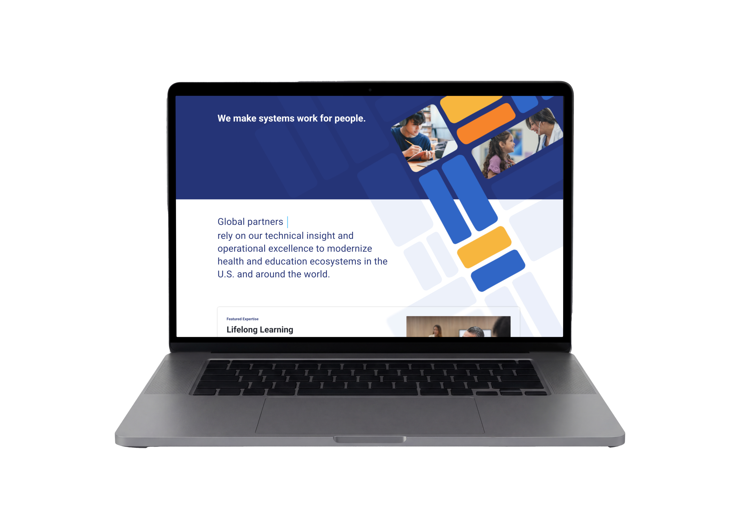
The rebrand happened alongside a complete rebuild of JSI’s website, creating an opportunity to rethink how the organization presented itself digitally. The previous site functioned largely as a repository for individual projects; the new site was repositioned as a more focused, brochure-style experience centered on JSI’s services and areas of expertise. The work required balancing the needs of leadership and communications with the realities of how people would actually navigate and use the site.
I worked closely with the UX designer and web developer throughout the process, collaborating on page flows, content hierarchy, imagery, and the overall visual experience. I explored and built modular template options, worked through UX challenges and distractions, and helped shape how the new brand system translated into a cohesive digital experience.

Extending the Brand: Life Sciences
As JSI expanded its work in life sciences, I developed the complementary sub-brand that maintained a clear connection to the parent identity while introducing a more technology-oriented visual direction.

I proposed and created a short logo animation for a dynamic, digital expression of the brand. Because JSI’s work in this sector includes significant logistics work, the animated mark was inspired by that relationship.
JSI Rebranding
JSI needed a more contemporary and cohesive brand, but the organization initially approached the problem as a color refresh. The design team advocated for a more strategic rebrand, establishing a complete visual system that could work across a complex, globally distributed organization. The new visual language also needed to help JSI's communications stand out in a competitive landscape while remaining flexible enough to support the many reports, presentations, proposals, and other materials produced across the organization. I co-led the development of that system, translating organizational strategy and history into a visual language that was recognizable, flexible, accessible, and practical for everyday use. From there, I helped carry the system beyond the core identity into templates, digital communications, social media, conference materials, sub-brand development, and a complete website redesign. View the Full Brand Guide
- Client:
- Categories:
- Skills:
- Share: